A quick thanks to Tom Edmonds at Eduserv who gave the LIDP a mention at his recent presentation at CILIP ARLG ’12: Measuring impact and quality on ‘Measuring the use of online resources’.
Discovering the Impact of Library Use and Student Performance
Brian Cox and Margie Jantti at the University of Wollongong have a new article out in EDUCAUSE Review online discussing library impact and the student experience. Their 3 key takeaways are:
- Without a valid, reliable way to collect data from various library and enterprise systems, it’s difficult to quantitatively assert how a library adds value.
- The University of Wollongong Library developed the Library Cube, a tailored database and reporting function that joins library usage data with student data, including demographic and academic performance information.
- Analysis of the resulting data reveals a strong correlation between students’ grades and use of information resources the library provides.
Thanks for the reference guys 🙂
Library usage and dropping out
I have spent the last few days looking at the relationship between using the library and dropping out of an undergraduate degree. I have some more results for you, but these ones are coming with a very big health warning – so, treat with caution!
You might remember that back in the very first blog I talked a bit about where your data comes from, and making sure that it is appropriate for the task at hand. Well, we’ve uncovered a slight problem with the Huddersfield data. Quite early on, it became clear that the information we had for ‘year of study’ was not accurate for every student. This is a challenge for two reasons. First, we don’t know whether usage patterns are the same for all three years of study, so we don’t want to compare different year groups without controlling for any variations that might be related to the year that they’re in. And second, we can’t use cumulative data to measure usage: the total usage of a third year student over their three years of study is likely to be higher than the total usage of a first year over their single year of study, but that doesn’t mean the student is actually more likely to use the library: it just means they’ve had more of an opportunity to do so.
Our initial workaround for this was to focus exclusively on final year students, who we could identify by checking to see whether they have a final grade or not. That was fine for the demographic stuff; it gave us a decent sized sample. But now we’ve moved on to look at dropouts, things have become a bit more complicated. The lack of ‘year of study’ data has become a problem.
We can’t use our ‘third year only’ workaround here, because the way that we were identifying the relevant students was by looking for their final grade: and, of course, if you’ve dropped out, you probably won’t have one of those! Also, we needed the first and second year students involved, to make sure that we could get a big enough sample for the statistical tests.
So what did we do? Well, first of all we had to find a way around the ‘cumulative measure’ problem that I mentioned above. Our solution was to create a binary variable: either a student did use the library, or they didn’t. In general, it’s not desirable to reduce a continuous variable to a categorical one – it limits what you can understand from the data – but in this instance we couldn’t think of any other options.
Even this still doesn’t completely solve the problem. Students who have been at Huddersfield for three years have had three times as long to use the library as those who’ve only been there for a year: in other words, they’ve had three times as long to move themselves from the ‘no usage’ category to the ‘usage’ one – because it only takes one instance of use to make that move. To try and get around this, we only looked at data for 2010-11 – the last year in our dataset. For the same reason, we’ve only included people who dropped out in their third term: this means that they will have had at least two full terms to achieve some usage. Now, this is only a partial solution: we still don’t know whether usage patterns are different in first, second, and third years, so we are still not comparing apples and apples. But we’re no longer comparing apples and filing cabinets.
Furthermore, before I share the findings (and I will, I promise!) I must add that we could only test this association for a combination of full- and part-time students. Once you separate them out, the test becomes unreliable: the sample of dropouts is too small. So we don’t know whether one group is exerting an unreasonable influence within the sample.
In short, then, there’s a BIG health warning attached to these findings. We can’t control for the year of study, and so if there’s a difference in usage patterns for first, second and third years, our findings will be compromised. We can’t control for full- vs part-time students, so if there’s a difference in their usage patterns our findings will be compromised. Both of these are quite likely. But I think it’s still worth reporting the findings because they are interesting, and worthy of further investigation – perhaps by someone with more robust data than we have.
So – here we go!
First up – e-resource usage. The findings here are pretty clear and highly significant. If you do not use the library, you are over seven times more likely to drop out of your degree: 7.19, to be precise. If you do not download PDFs, you are 7.89 times more likely to drop out of your degree.


Library PC usage also has a relationship with dropping out, although in this case not using the PCs makes you 2.82 times more likely to drop out of your degree.

We tried testing to see whether there was a relationship between library visits and dropping out, and item loans and dropping out, but in these cases the sample didn’t meet the assumptions of the statistical test: we can’t say anything without a bigger sample.
So why are these results interesting? Well, it’s not because we can now say that using the library prevents you from dropping out of your course – remember, correlation is not causation and nothing in this data can be used to suggest that there is a causal relationship. What it does offer, though, is a kind of ‘early warning system’. If your students aren’t using the library, it might be worth checking in with them to make sure everything is alright. Not using the library doesn’t automatically mean you’re at risk of dropping out – in fact, the number of students who don’t use the library and don’t drop out is much, much higher than the number who do leave their course prematurely. But library usage data could be another tool within the armoury of student support services, one part of a complex picture which helps them to understand which students might be at risk of failing to complete their degree.
Time of day of usage and outcomes
It’s been a long, long time since the last blog. Sorry! We have been busy – more of which later. But for now, I’d like to share some initial results from the work we’ve been doing looking at time-of-day of usage and outcome.
Previous work by Manchester Metropolitan University suggested that overnight usage is linked to poor grades for students. This makes intuitive sense: surely it can’t be a good sign if someone based in the UK is using library resources at 3am on a regular basis – that looks like someone who is struggling with their workload. We wanted to test whether this finding would hold true with the Huddersfield data.
At first glance it seemed like it might. Look at this graph, showing the e-resource usage patterns for students with all four grade outcomes over a 24 hour period*. The firsts have much higher usage than anyone else during the daytime; at night, although the timings become similar, the students who achieved thirds seem to have the highest use (around 4-5am).

But that’s not really a fair comparison. We know from the Phase 1 work that there’s a positive relationship between usage and outcome – in other words, the higher your grade, the higher your usage. So maybe what the first graph is showing is just that people with firsts have higher usage – full stop. The difference isn’t related to time of day at all.
To test this, we created a new variable, looking at the proportion of usage that happened within a certain hour, measured as a percentage of overall usage. This eliminates any bias which might emerge by considering overall usage. For example, a student who logged in to e-resources 20 times, 2 of them between 10-11am would have the same figure (10%) as a student who logged into e-resources 400 times, 40 of them between 10-11am. The much higher overall number of the second student becomes irrelevant, and we’re able to look at a true reflection of usage patterns. The following graph shows what happens.

What a difference! The lines are almost identical. Again, you can see that there’s a point around 9pm where users who go on to achieve a third overtake users who go onto achieve a first, and they maintain their dominance around 3-7am. But the overall message is that patterns of e-resource use don’t differ very much by outcome, it’s just the volume.
We tested these findings and, sure enough, although there is a statistically significant difference in overall usage between 9pm and 9am for researchers with different grades, there is no statistically significant difference in the percentage of overall use which takes place within that timeframe.
So we’ve found something different from Manchester Met. I should stress that our methodology is different, and more simplistic, so it may just be that we haven’t managed to identify a relationship that does exist – perhaps, once you factor out lots of the other variables which affect outcome, a relationship can be detected. But you’d need a lot more data to do that, and a much more complicated model.
As a final footnote – what’s happening around 8pm in the proportion of usage graph?! We’ve tentatively termed this the ‘Eastenders gap’: high-achieving students seem to have a much greater resistance to TV-soap-based distractions than those who go on to get a Third! One to explore in the focus groups, perhaps…
* When we say ‘usage patterns over a 24 hour period’, we’re actually aggregating the whole year’s data. So 3 logins between 10-11am means a user has logged in 3 times during that hour over the course of a year. We don’t count multiple logins in a single hour on the same day (e.g. someone logs in, times out, and logs in again – that’s just one login as far as we’re concerned).
Our first results!
There’s a little bit more methodology here – but also some results! I promise!
I have been trying to organise the data so that we create some useful variables ready for analysis. As I said in my last post, you need to know what your data actually means before you start analysing it. But sometimes you will also need to manipulate it before you start your analysis, because the variables you’ve been given aren’t quite right for the analysis you want to do.
One of the aims of the project is to understand the characteristics of people who use the library in a bit more detail. Now we know there’s a relationship between usage and attainment, we need to know whether there are any groups who use the library less than others, so that interventions can be targeted towards them. We’re going to look at a number of factors, including gender (Dave’s already posted some early graphs on this), ethnicity, country of origin, age (again, Dave’s got some graphs) and discipline.
Now, to return to my point about manipulating the data – we have some very detailed information about these characteristics for students at Huddersfield. In fact, in some categories there are only half a dozen students. If we were to use this data, it might be possible for a reader to identify individual students, which is a BIG data protection no-no.
So instead, we need to aggregate up. And that raises all sorts of questions. What are the best groupings we can arrive at in order to (a) protect the students and (b) remain theoretically consistent. It might be, for example, that by aggregating the Chinese and the Black – Other categories we could reach a number which would guarantee students can’t be identified – but do we really think those groups have anything in common with one another? Probably not. So it doesn’t make a lot of sense to bung them in together when trying to understand their library usage.
Here’s some early results, looking at the total number of hours in which a student was logged into e-resources (via EZProxy), and the total number of PDFs that students downloaded, using the aggregates that I’ve chosen. First, the ethnicity ones:

These data are aggregated – each category, apart from Chinese, contains at least 2 different groups from the original data. If you look at the graphs showing the original datasets, which I can’t share here because some of the groups are too small, you can see that there are considerable differences between groups that we’ve aggregated. So that’s something we’ll need to bear in mind – that differences between the groups within our aggregates might be so big as to require us to rethink our groupings. If they don’t all look similar, perhaps it’s not helpful to group them together?
And here’s the same kind of graph, looking at country of domicile.

Again, that’s been aggregated up, in this case by Huddersfield in the original data that was sent to me. I think I’m going to have a play to try and find a happy medium between their highly-aggregated data and the very detailed country-level data, which would reveal individual student identities. I’m particularly interested in what’s going on with those high downloads in the European Community data. I don’t think it’s just an outlier, as there’s a reasonable sample so one or two high usage levels shouldn’t skew the overall picture. So is there a big difference between, say, Balkan states and older EU members?
I suspect that some librarians might be a bit uncomfortable with the idea of using such personal data about students. Ethnicity in particular can be a very sensitive issue, and we will have to tread carefully when we talk about differences in usage. But I think the point to remember is that all of this work is done with the aim of improving services to students. If we can use this data – on a completely anonymous basis (I have nothing to link the data points back to an individual student as the student numbers have been removed before the data was sent to me) – to understand what students are doing, and how it’s affecting their outcomes –and if we remain mindful of our need to protect student confidentiality – I think it can only be a good thing.
The next steps will be for us to test whether these differences are statistically significant – that is to say, whether they are a fluke that’s happened to occur in our particular sample, or whether we can say with statistical confidence that they exist in a wider general population as well. For that, we go beyond the familiar frustrations of Excel to the brave new world of …. SPSS! Wish me luck…
Some methodological musings – wait – come back!
It’s been rather quiet from me on the blog front, so I thought I would pull my head out of the data for a few minutes and write a post. It’s a bit early to produce anything meaningful in terms of results, but I know that Graham was keen that I share some of my methodological stuff with all of you, so you can blame him for what follows!
Now, data can be terrifying. In my previous job in the museums sector I encountered many a hardened professional reduced to quivering jelly when faced with their audience figures. One of the big problems is that, as humans, we usually communicate information by creating narratives, and we’re more used to seeing those in a Word document than an Excel spreadsheet. But fear not! The stories are there. You just need to find them.
Of course, nothing is that simple. Perhaps you –like me – were instructed by your mother at a tender age that it is not alright to ‘tell stories’, used as a gentle euphemism for barefaced lies. Yes, stories are easy to follow, but sometimes that’s because they represent an over-simplified version of more complex truths. So with this project – as with any data analysis – we need to find the right stories to explain what’s going on in the data.
I’ll be going into this in more detail over the coming weeks, I hope, as the analysis progresses. What I want to do in this post is to explore some of the early things that you can do (and that we have done) to make sure you tell a compelling, but also truthful, story with your data.
1. Make sure you have some questions, and that they’re based on a valid theory. While there’s some merit in just taking a great big dataset and then looking at it to find interesting relationships, this is quite a risky strategy for social research. It’s known as ‘data mining’ and it can turn up all sorts of strange results. One famous example uses international data to show that possessing a TV is associated with living longer. There’s no discernible medical reason that this should be the case, of course, what’s actually going on here is that there’s a third, ‘masking’ variable involved – being rich. If you are (internationally-speaking) rich, you are both more likely to have a TV, and more likely to live longer. But you don’t get that from the data – all it tells you is that TV ownership goes alongside a long life. You need the background theory to understand that the masking variable exists, and to do analysis that incorporates it. This means that the story you tell about the data will not just be true in terms of reporting on relationships that exist, but also in terms of explaining it. (We’ll come back to take a proper look at causality another time.)
In this project, we’ve worked with a wide range of library staff, and other support teams at Huddersfield, to get their take on the interesting questions that we should ask based on their reading and professional experience. Don’t underestimate the power of your own knowledge in formulating your research questions!
2. Understand your research data. It sounds really obvious but this is so important. Make sure you know exactly how the data were collected, as this will have an enormous impact on what they tell you. There’s a great example of leading questioning in Yes, Minister: Bernard the civil servant is shown to be the perfect balanced sample by being simultaneously for and against conscription, depending on how the question’s asked. If there are any big gaps in the data, make sure you understand why they are there, and whether they’re going to affect your analysis in any way.
You might think that leading questions aren’t so important when looking at library usage – and you’d be right – but the method of collection can still affect the findings. We’ve looked at usage of various online resources by the hour, and Dave explained very thoroughly exactly what he meant by that (that the student had used the resource at some point within that hour). If he hadn’t, I might’ve plodded along thinking that the student had used the resource for the full hour, or for the majority of an hour, which would change the findings significantly. We’ve also got some gaps in our UCAS data, which we think might be related to the student’s school, so we need to take that systematic variation into account in the analysis.
I think that’s probably enough from me for now, but I will look forward to coming back at a later stage and regaling you all with more methodological excitement!
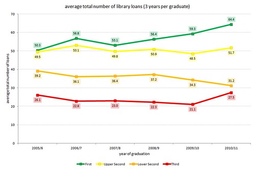
Borrowing – year on year
Now that we’ve extracted the usage data for 2010/11, we can update some of Huddersfield’s usage graphs from the first phase of the project 🙂
First of all, an update of the graph that shows the average total number of items loaned to honours degree graduates for the last 6 years. As before, for each graduate, we’re looking at the total number of items they borrowed over 3 years (i.e. the graduation year, and the 2 previous years):
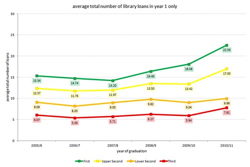
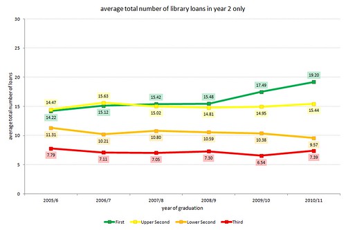
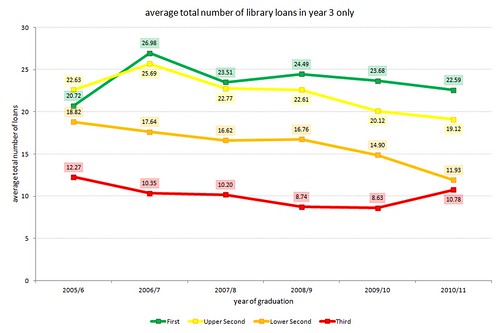
…and updates of the graphs that show borrowing by year of study:
borrowing in year 1 only
borrowing in year 2 only
borrowing in year 3 only
LIDP on the road in 2012
Ellen and I will be presenting a poster at the LIBER 41st Annual Conference, 27 June – 30 June 2012, University of Tartu, Estonia. We look forward to sharing the early results of Phase II of the project with you and hearing your thoughts.
Stone, Graham, Collins, Ellen and Pattern, David (2012) Digging deeper into library data: Understanding how library usage and other factors affect student outcomes. In: LIBER 41st Annual Conference, 27 June – 30 June 2012, University of Tartu, Estonia.
![]()
Further analysis
We are pulling out much more detailed data for LIDP2, including the time of day a resource was accessed. Some initial graphs are now available here, however, please note that this is just raw data and need to be cleaned up.
There do seem to be some interesting trends. For example the graph below implies that not only do students who achieve a 1st class degree use more e-resources, but they also use more during ‘office hours’, students who receive a lower degree are the highest uses overnight – this appears to tally with other research that shows that students who log in to a universities VLE are more at risk of dropping out.

The next graph appears to show that students who obtained a first use e-resources most between 2am and 7am – perhaps chasing deadlines? Students who get a 1st peak btween 10am and 11am.

Please note that we haven’t cleaned this data up yet, e.g. we haver not excluded overseas users.
A spot of cross fertilization!
We’ve spent an interesting week talking to other JISC projects.
We’ll be working very closely with the Copac Activity Data Project over the next 6 months and had a good meeting with them on Tuesday.
CopacAD will conduct primary research to investigate the following additional use cases:
- an undergraduate from a teaching and learning institution searching for course related materials
- academics/teachers using the recommender to support the development of course reading lists
- librarians using the recommendations to support academics/lecturers and collections development
Huddersfield will be one of the libraries providing data and we’ll also be participating in the focus groups.
We are both undertaking work packages around business case feasibility studies and hope to pool our activity by sending out a joint questionnaire later in the project. We will also be participating in a RLUK/SCONUL workshop in April.
Yesterday the project happened upon another JISC project at Huddersfield, the JISC EBEAM Project.
EBEAM will evaluate the impact of e-assessment and feedback on student satisfaction, retention, progression and attainment as well as on institutional efficiency.
EBEAM is looking at GradeMark and we think there is a real opportunity to link this into the LIDP project in the future.
Watch this space for more developments with both projects over the coming months.